Lazada Express Branding
📅 November 02, 2019
•⏱️2 min read
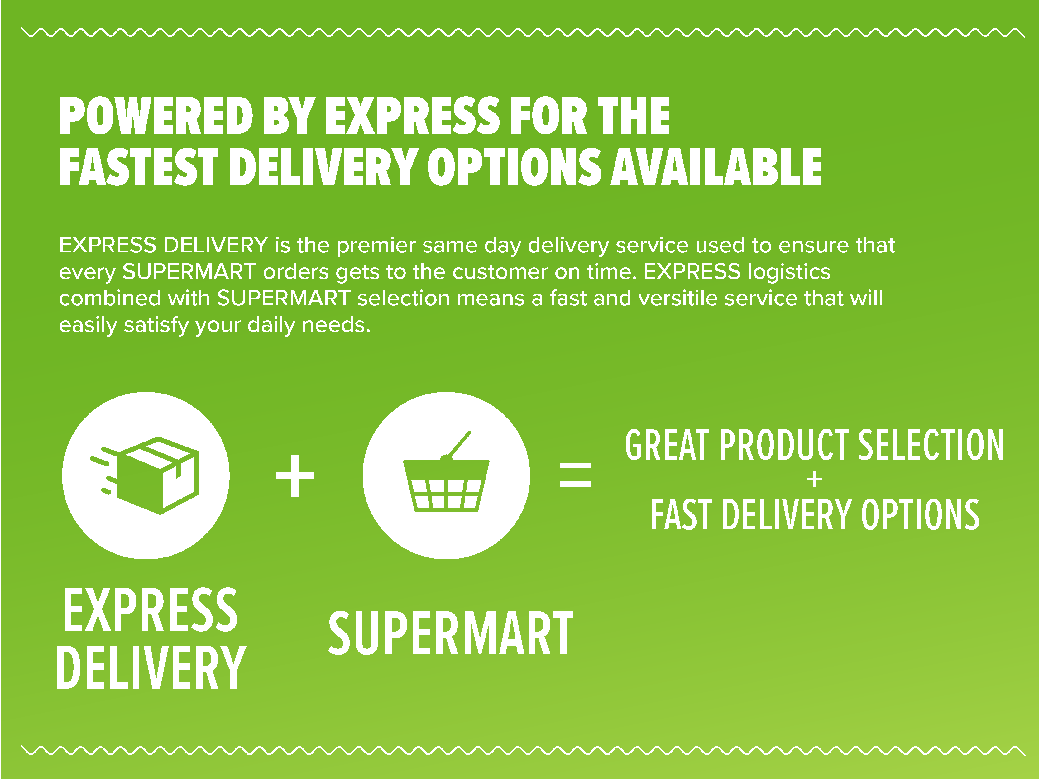
While working for the Lazada Group in Singapore, I assisted with the graphic design and brand positioning of their EXPRESS and SUPERMART sub-services. As part of their general expansion plan throughout South East Asia, Lazada had explored the idea of same-day delivery service to compete with companies like Amazon Prime Now. The EXPRESS service would focus on the same day delivery of general goods, while SUPERMART was more focused on food and household items.
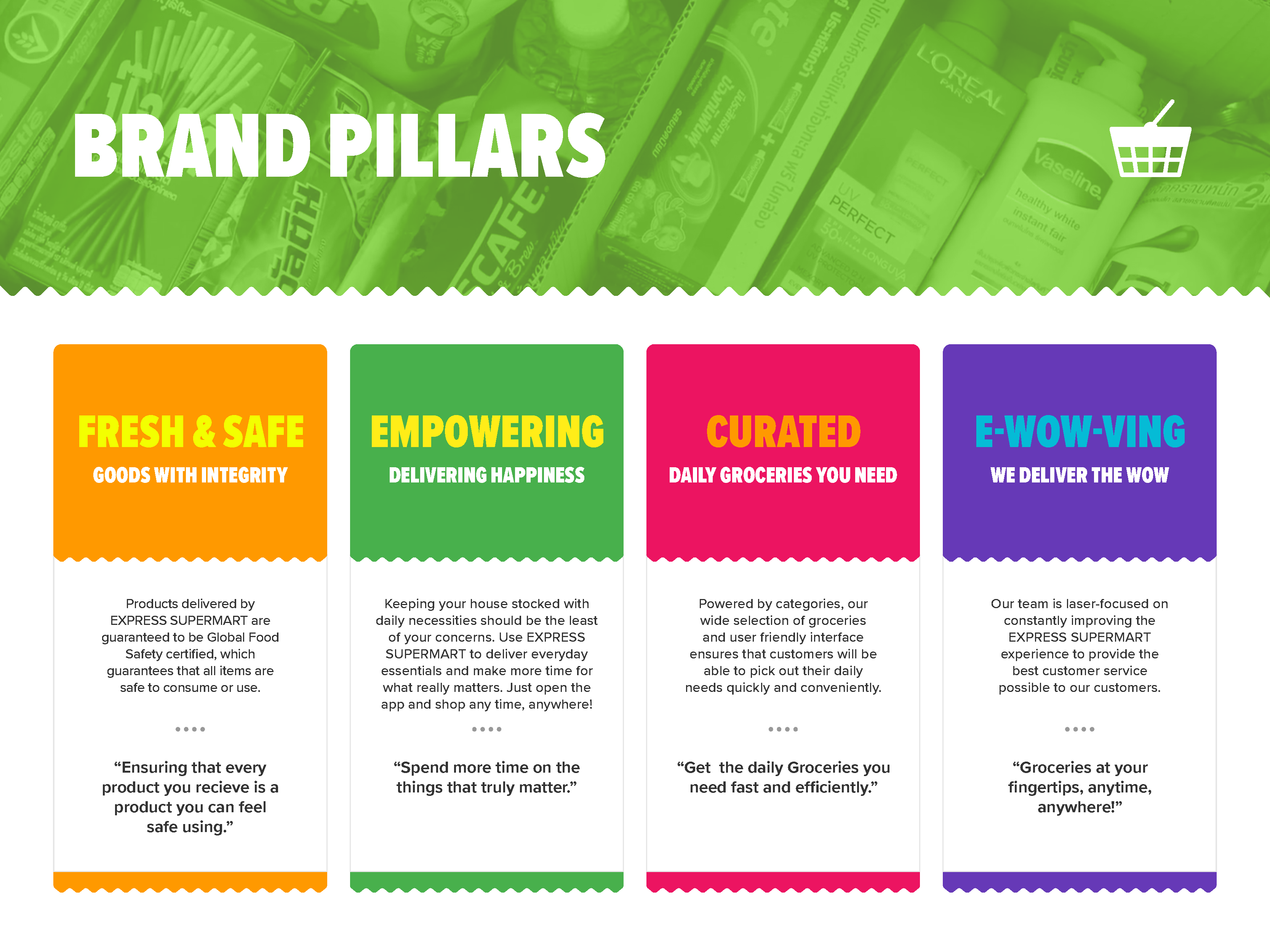
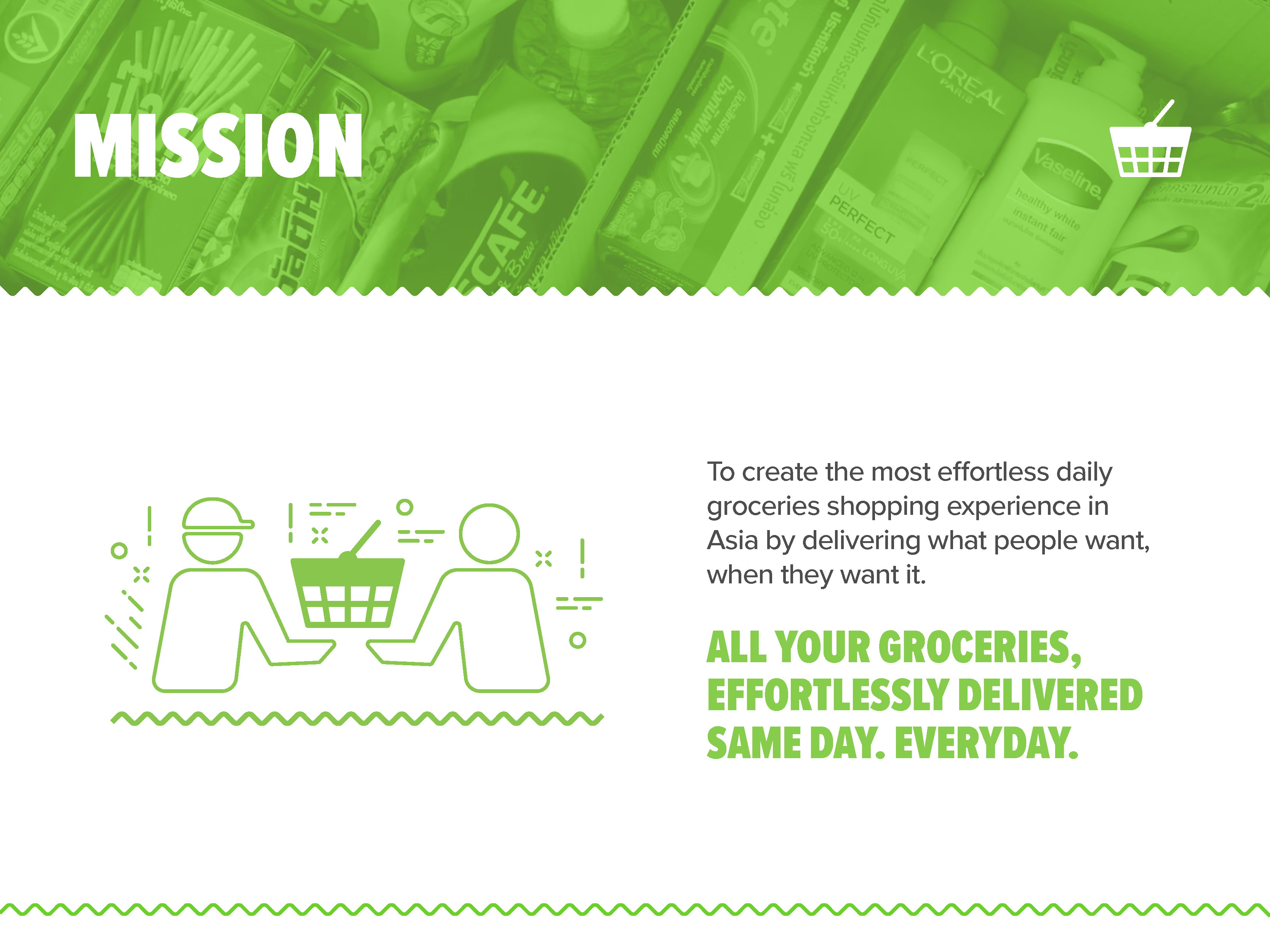
Our design goal was to establish the EXPRESS and SUPERMART names as distinct entities with the Lazada umbrella of services, which meant creating a system of mission statements and brand pillars with which we could align a visual language to. This resulted in the creation of a brand guide, along with a series of banners, templates, and email designs all of which helped articulate the precise nature of the EXPRESS and SUPERMART brands.
EXPRESS DELIVERY brand guide
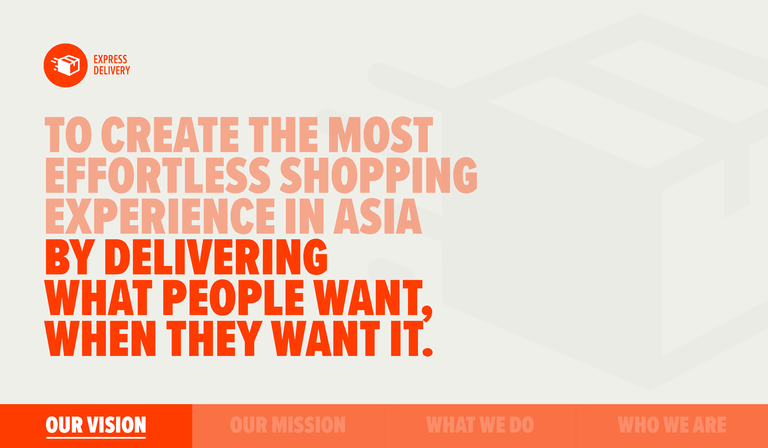
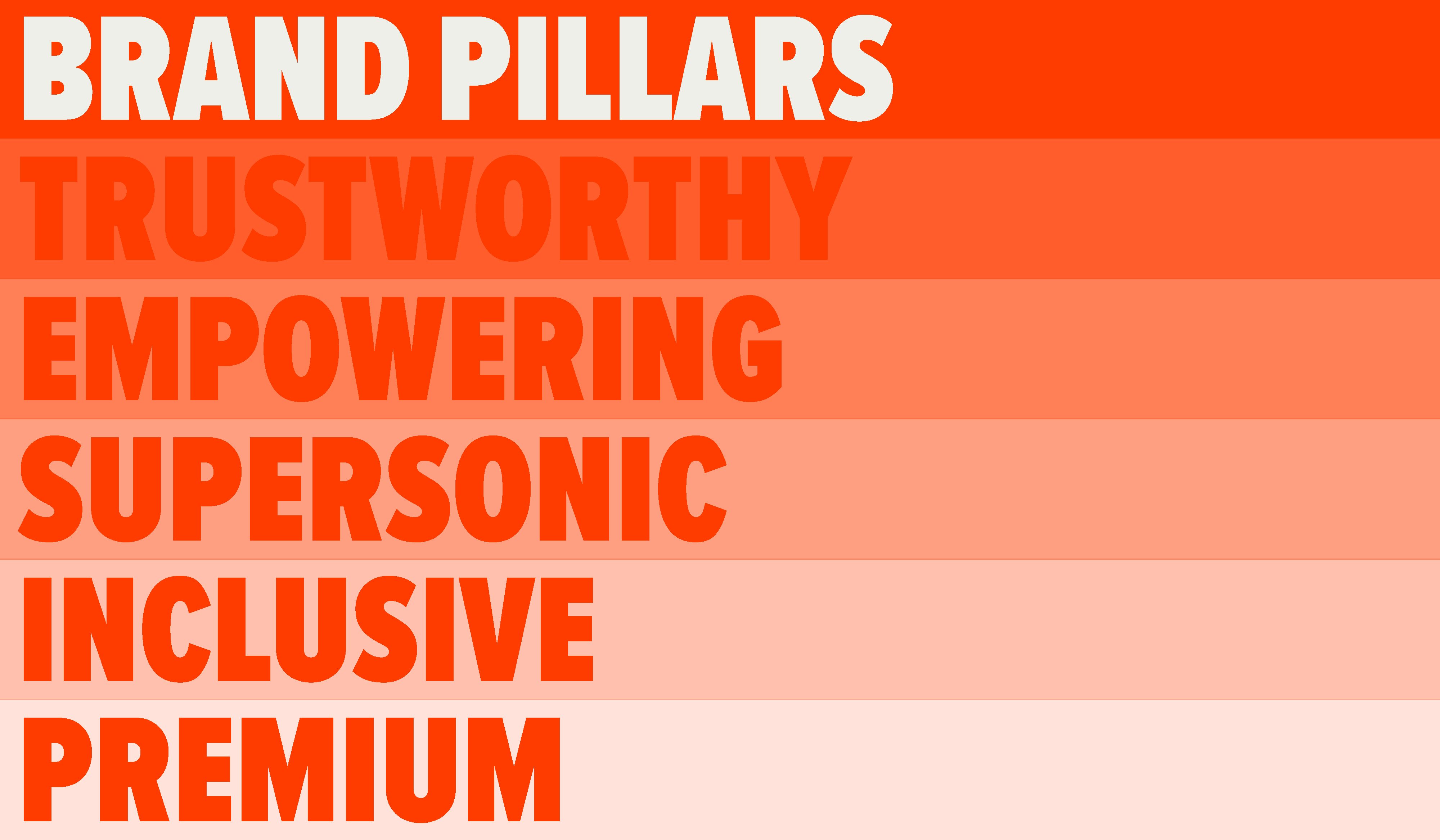
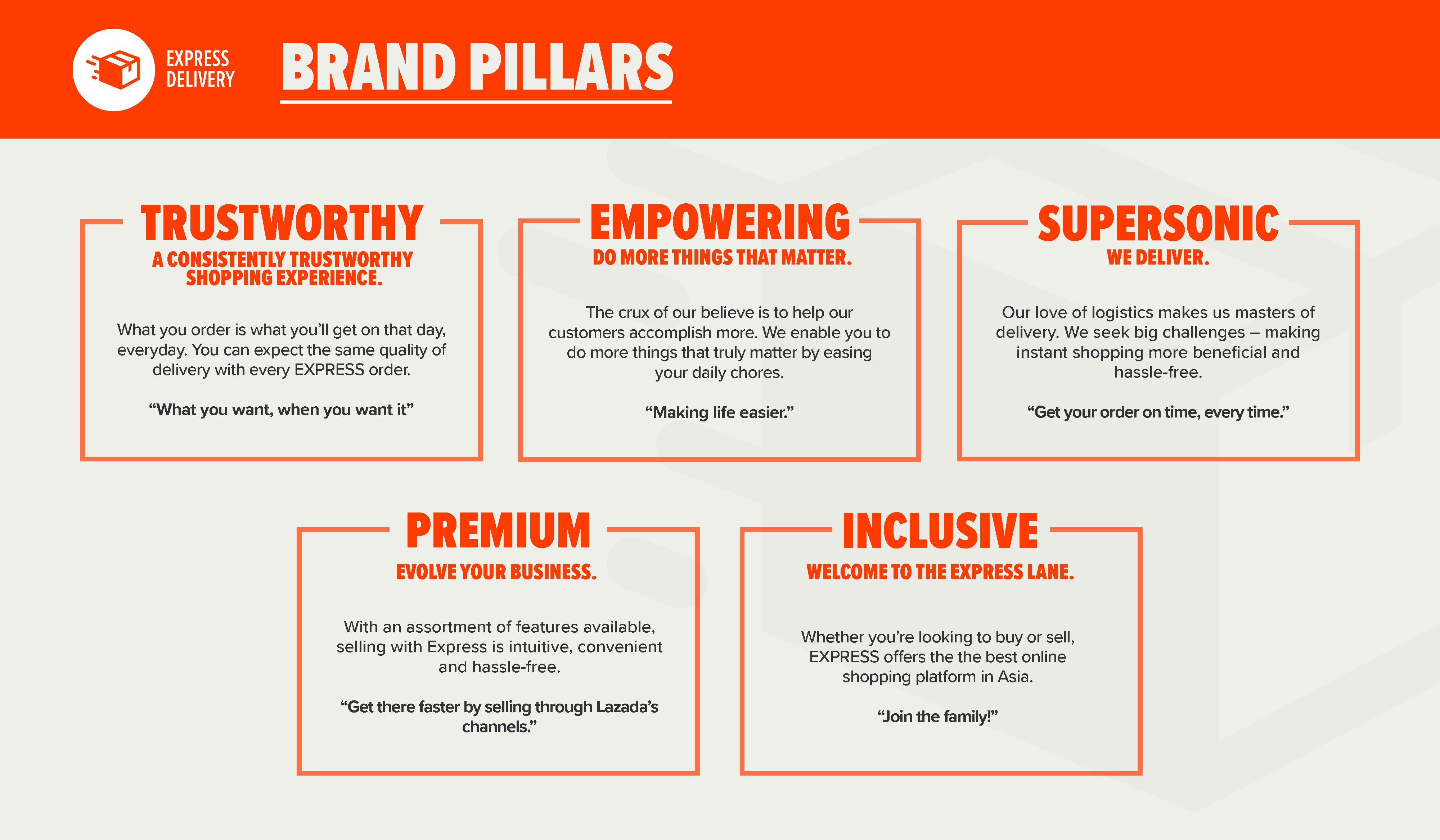
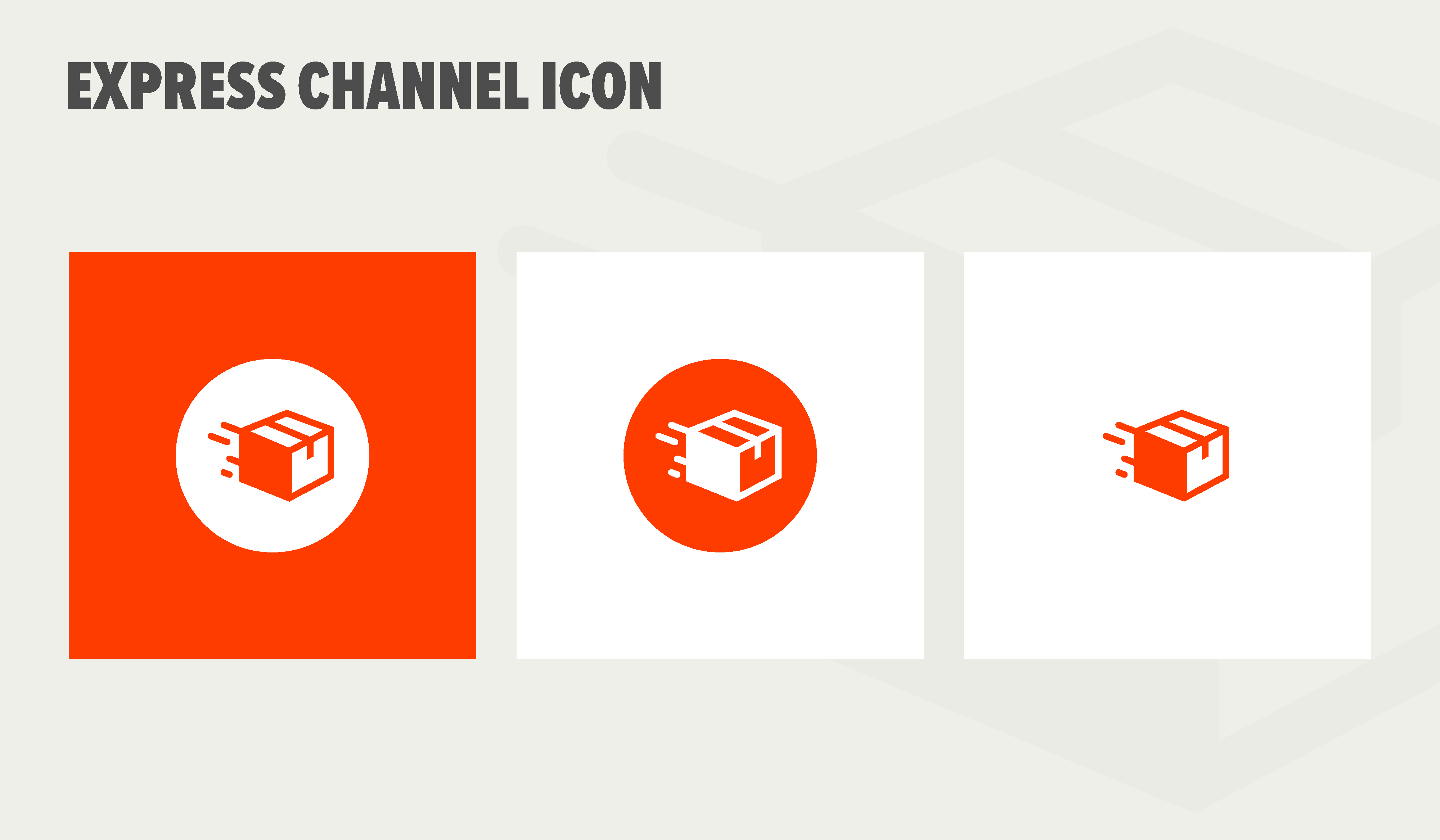
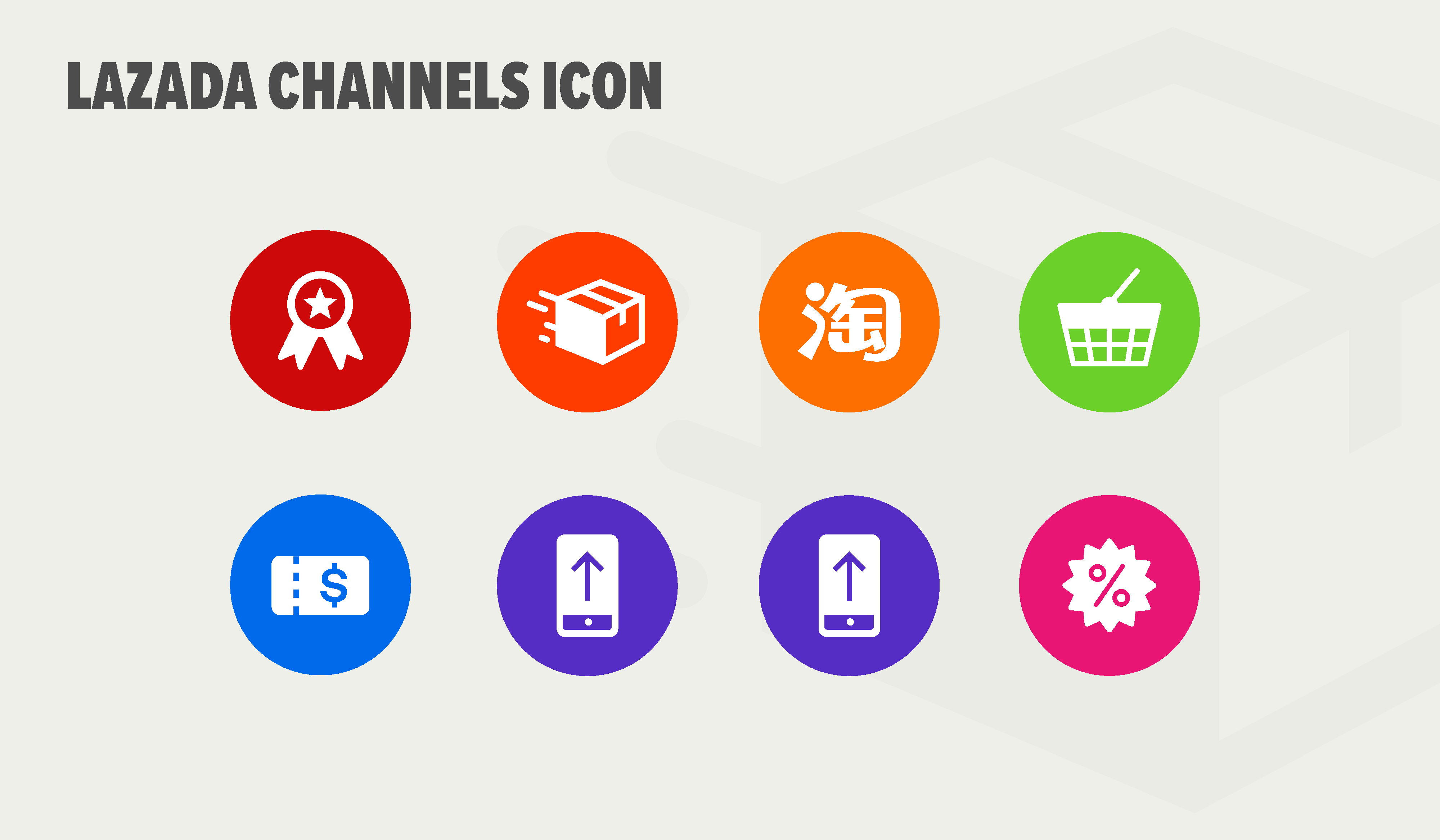
As a very new entity under the Lazada umbrella of companies, our EXPRESS DELIVERY service suffered from a lack of cohesion with regards to identity and visual alignment. Through discussions with stakeholders and the core Lazada branding team, we worked to establish brand pillars which would inform our messaging and use of visual elements. We recorded these decisions regarding the EXPRESS corporate identity in a branding guide, which was in turn used to maintain consistent messaging and visual alignment across any assets generated for the platform. Page samples:

Express Delivery Brand Assets
Banner sample:

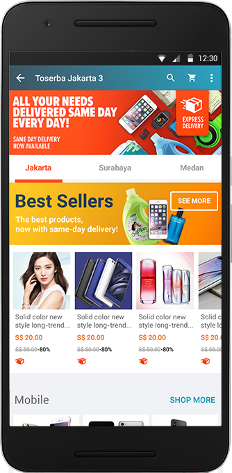
Seller information packet samples:

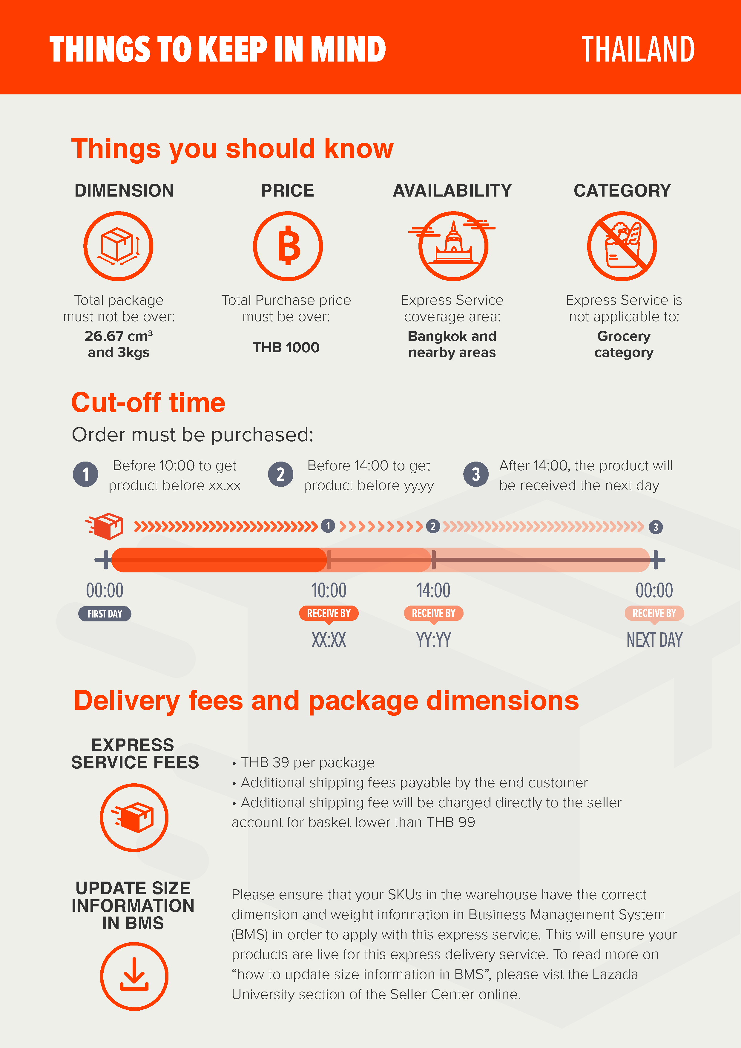
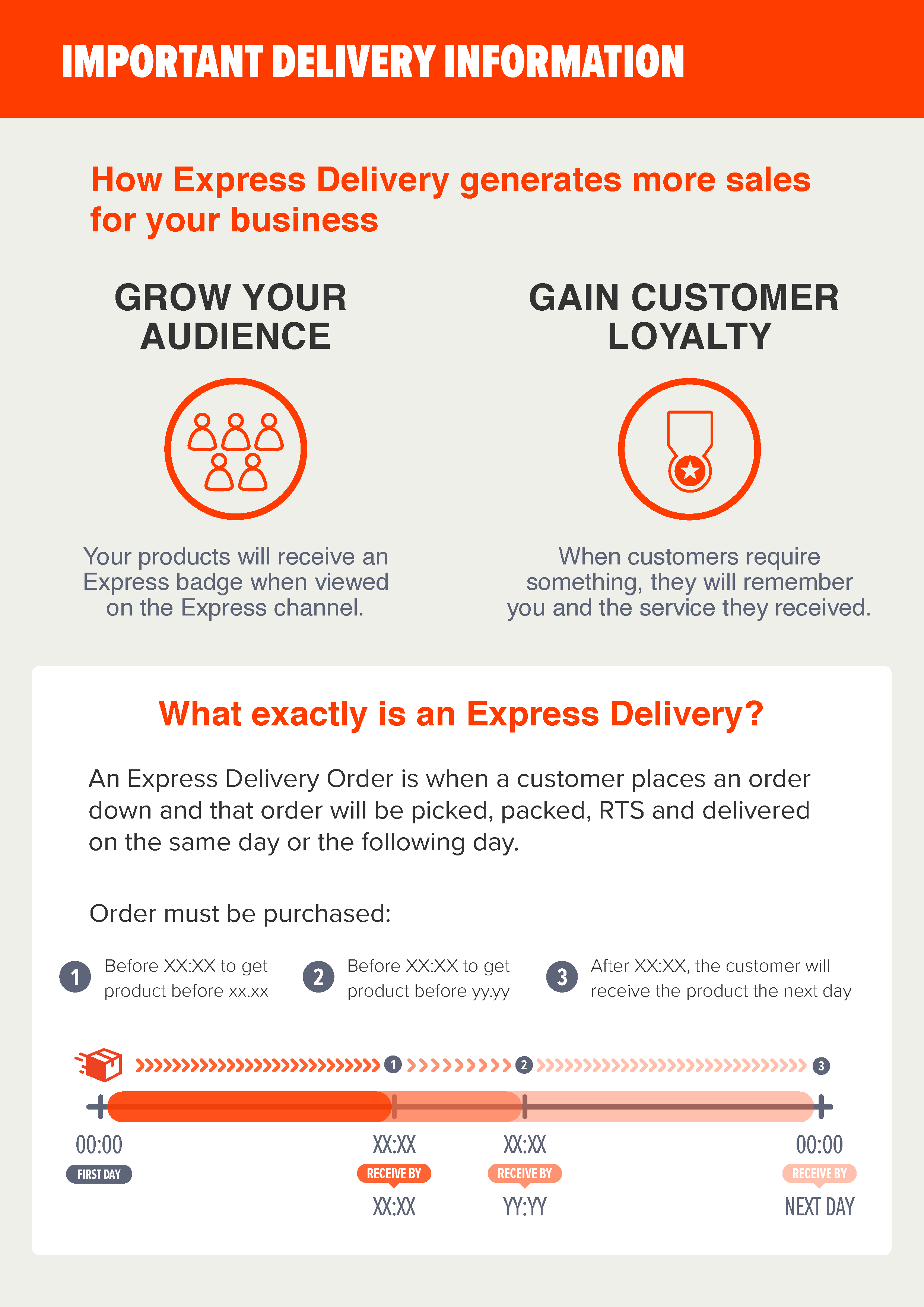
Animation experimentation:


SUPERMART branding
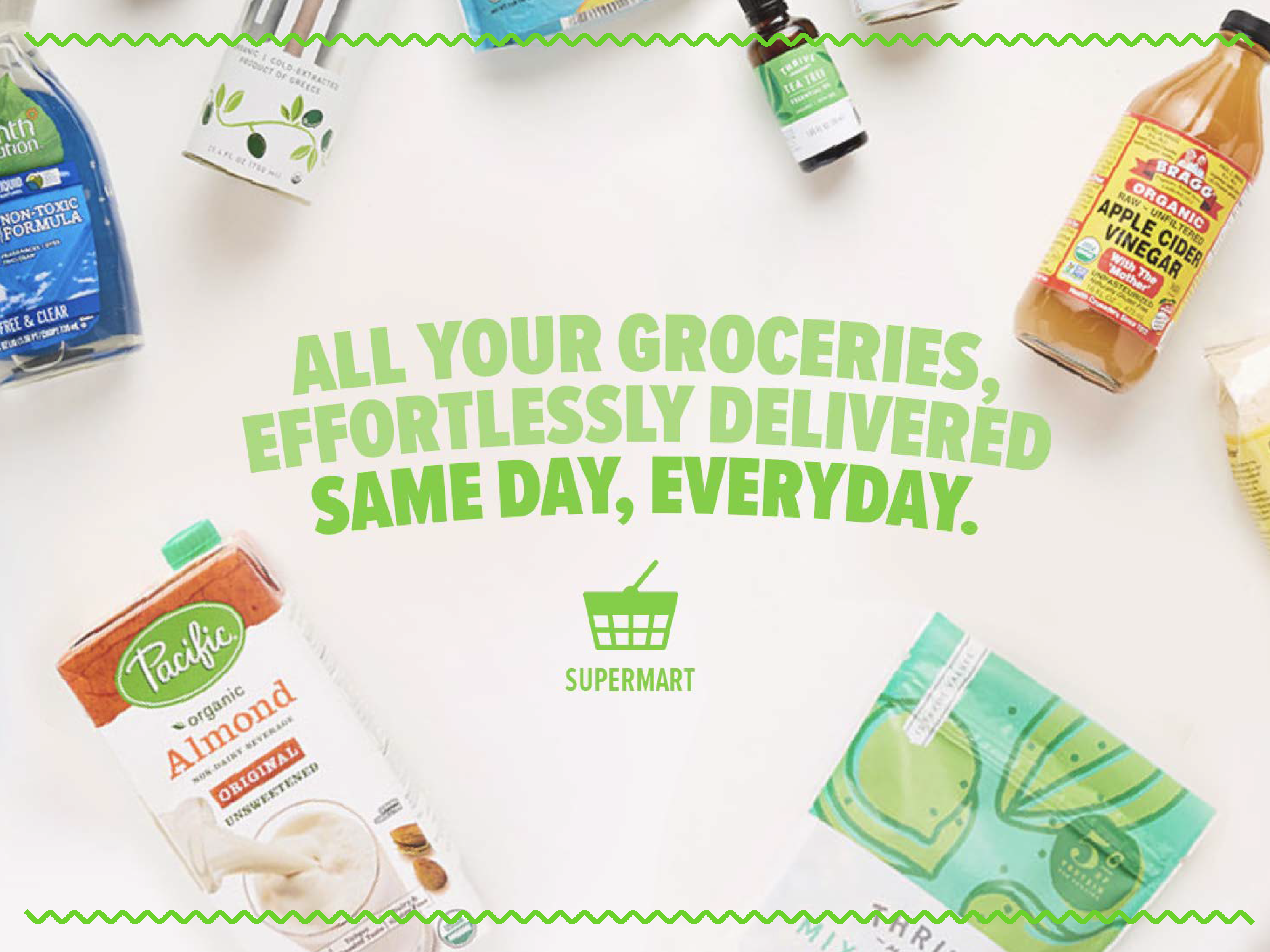
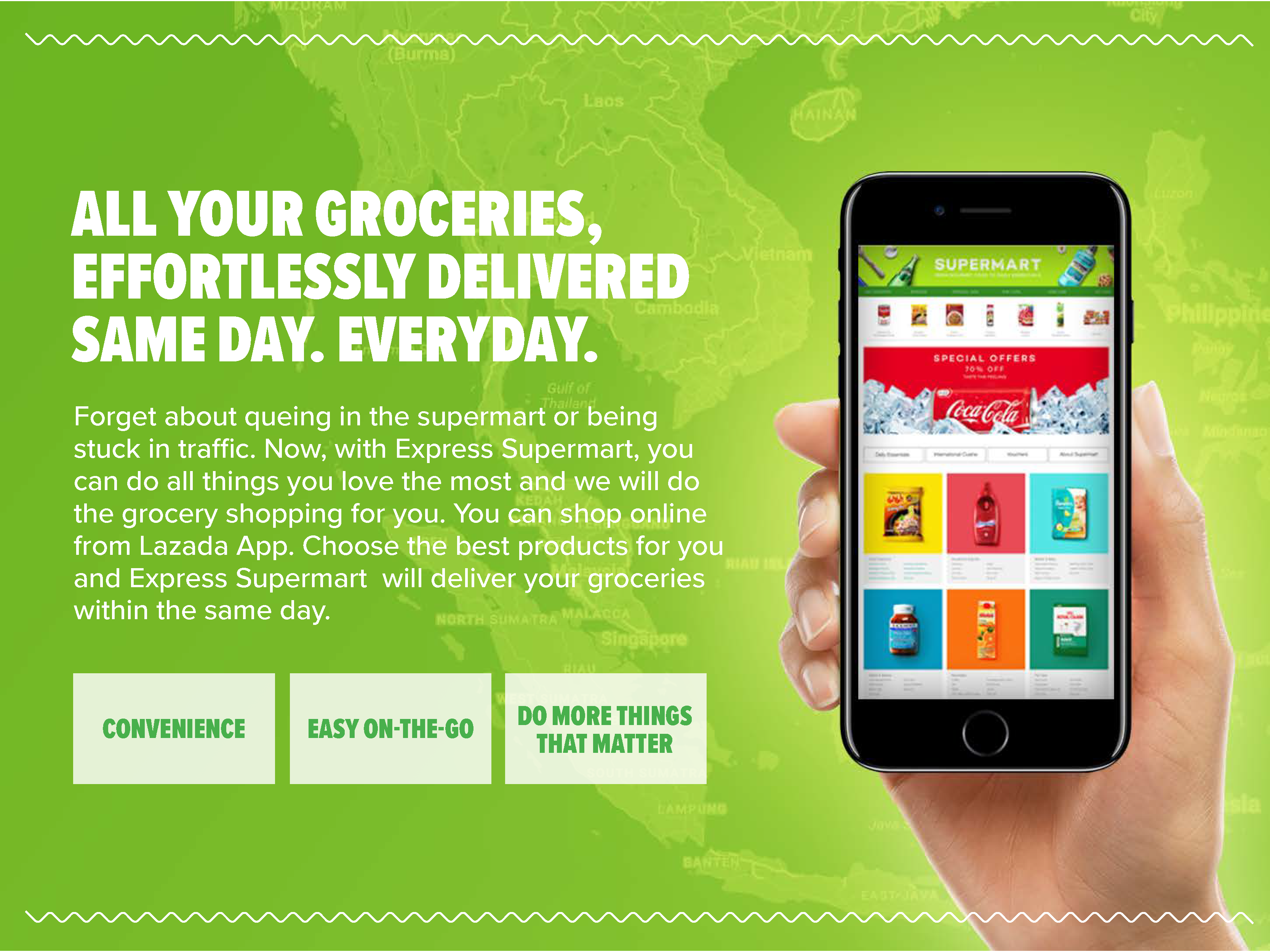
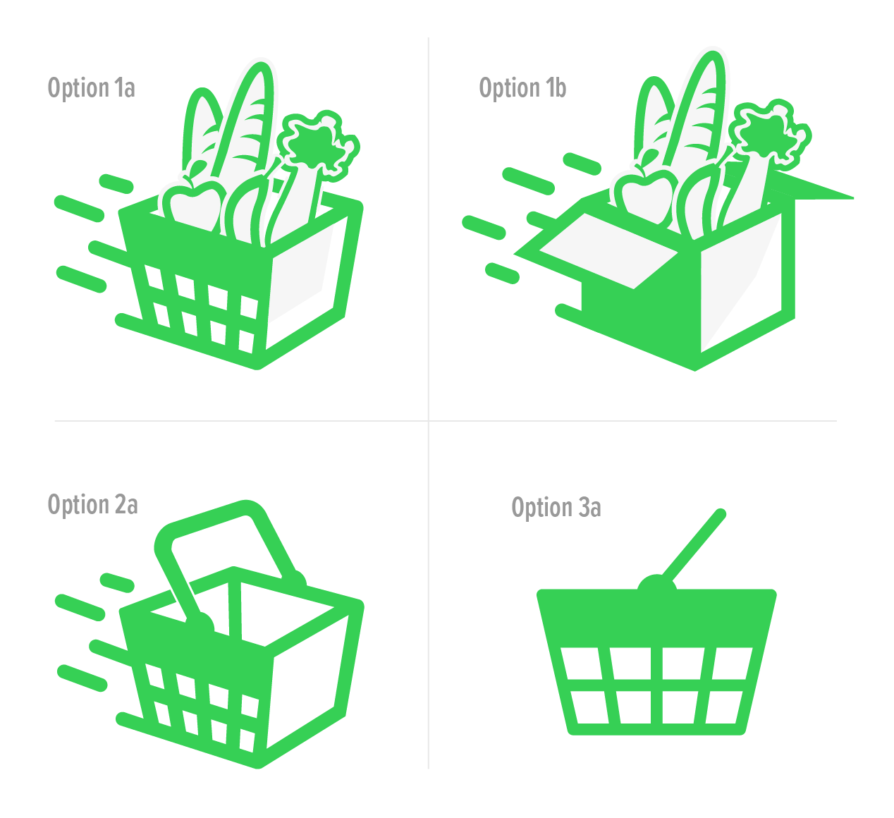
In addition to establishing the EXPRESS DELIVERY identity, we also started the process of looping in the existing SUPERMART brand and aligning it as a co-platform that would exist alongside the EXPRESS platform. We created a similar brand guide that expressed values and visual styles distinct from the main EXPRESS platform, but characterized them in a similar way so as to make its messaging clear and intuitive.
Logo experimentation:
Brand book samples:
